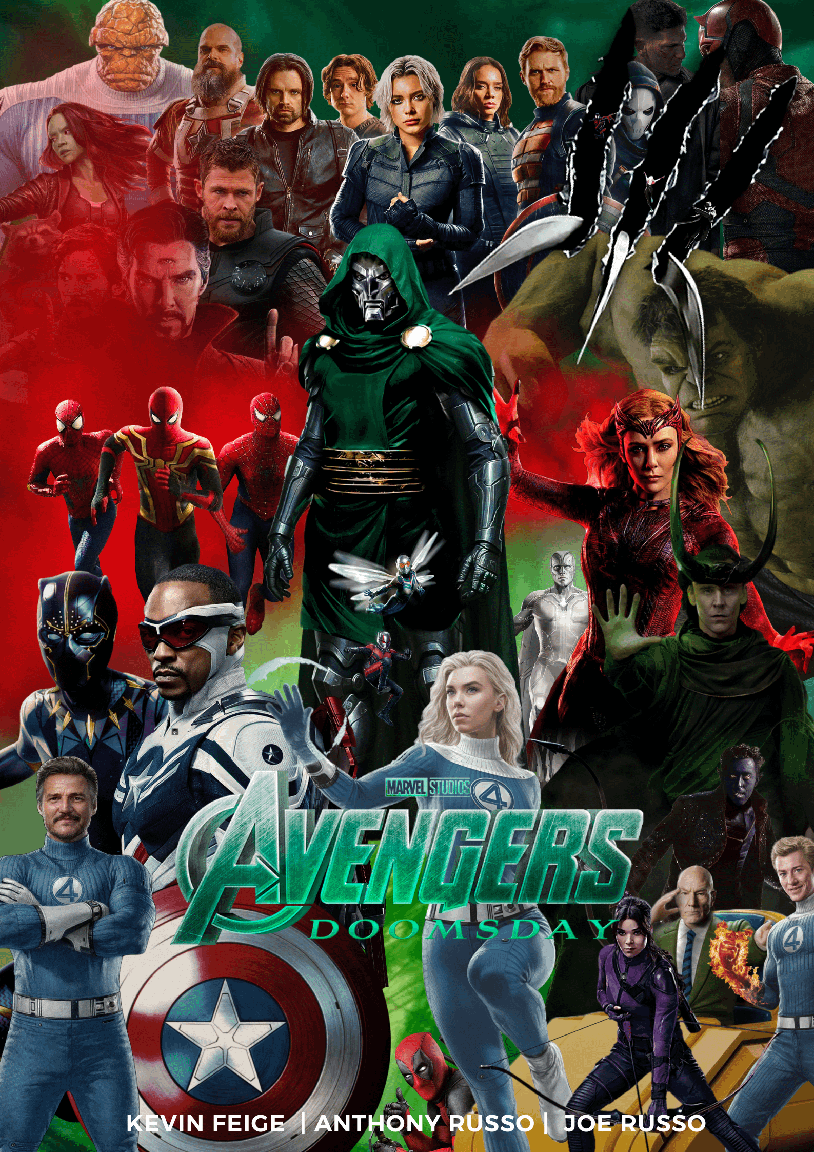
Made this on canva earlier let me know what you guys think! I've never desgined anything before so some tips on what could be better would be helpful.
Commentaires
game0fgnomes2025-10-01 18:41
Hey friend! First, congrats on your first poster, I can tell you put a ton of work into it.
A few pieces of advice:
• There is a lot going on but it’s hard to tell what anything is without some major concentration. I would aim for Simplicity, Consistency, and the Golden Thirds: start with a specific color palette and match the styles of the characters to look cohesive. Maybe pick a few major characters you want to see and start with that. Then, arrange them on a grid (Google the Rule of Thirds), which will help draw your audience’s eyes to the points of interest you’re most focused on.
• I think the Kevin/Russos text at the bottom is a little out of place and distracting. The Avengers speak for themselves!
• Make the logo you’re using stand out more. Right now, it’s a little hard to read. I would take out any models from behind the text and then add a “Lift” effect, which Canva is great for.
• I love the Wolverine claws as an idea, but they feel out of place with the rest of the poster!
• Ditto with the red smoke— the characters behind it are obfuscated.
Happy creating! Keep posting your stuff :)
ClaytonWest742025-10-02 21:58
I just wanted to say that’s a very nice way of putting your point across
RedGuardian-2025-10-03 05:04
Appreciate the feedback. I'll definitely take your advice on board next time I make something!
marvelcomics222025-10-02 14:43
I like how you have lots of characters, but the colors and lighting don't really blend well together. But it's still great work.
Trickster14052025-10-02 15:48
The worst so far
RedGuardian-2025-10-03 04:42
Wait till you see the version I made where it's just jonah Hill instead of the Marvel characters.
hyperparrot33662025-10-02 19:51
Bro wtf is this 😭
No Symmetry, no common colour, random head sizes and what is that wolverine claws in the poster.
GingerWez932025-10-02 20:21
I'll take this over AI generated slop any day!
BatGasmBegins2025-10-03 00:01
Here! Here!
miloshem2025-10-02 21:20
Magazine collage...
RedGuardian-2025-10-03 04:41
I made this whilst I was on the toilet
not-my-other-alt2025-10-03 04:55
It was the second best thing you made there.
RedGuardian-2025-10-03 05:01
Can't argue with that
TheIratePrimate2025-10-04 22:36
His number two was number one.
hosenfeffer_2025-10-02 20:26
Poor Quill
thereturnofbobby2025-10-02 20:41
I was 14 once too.
Youngling_Hunt2025-10-03 00:45
I skipped 14. Went straight from 13 to 15. What'd I miss?
samlefrog2025-10-03 01:11
Not much.
thereturnofbobby2025-10-03 01:21
it's mostly filler bro
IndependentBit97452025-10-03 03:09
it's just filler tbh
AloyAlphaprime20742025-10-02 20:58
*Noo!* I was sure this was real
gripless2025-10-02 21:28
Great stuff. Definitely keep it up!
FullGuarantee47672025-10-02 22:35

reldnahcAL2025-10-02 22:43
Honestly OP, it looks awful but it’s a good start. Keep working on it and you’ll get better.
dextroseskullfyre2025-10-02 22:52
oof
Primus71127652025-10-02 23:16
You can't just grab a load of unrelated pngs and stick them all over the place to call it a poster.
"I've never designed anything before", yeah no shit.
RedGuardian-2025-10-03 05:02
Well, i can because I did
Elite_Stunner2025-10-02 23:18
Taskmaster is dead
BatGasmBegins2025-10-03 00:01
Looks cool! Make more!
emcee_you2025-10-03 00:41
r/therewasanattempt
PieKie42025-10-03 02:22
we all start somewhere, i really like the bleeding red you did with the spider-men, maybe try that with some other groups of characters (f4, thunderbolts) and have green as the centrepiece?
TheRealDeweyCox20002025-10-03 03:00
This isn’t great but don’t listen to the haters. Keep working and improving
antimarc2025-10-03 03:30
please stop
ForeignAdvantage59312025-10-03 03:58

Meizas2025-10-03 04:06
Somehow, Taskmaster returned
DuckyHornet2025-10-03 04:46
Someone's got to crush Jenny Tian's spirit with clear rules, and my god is she the right MCU character for the job
Ster_Silver2025-10-03 04:41
As someone who also uses Canva, this isn’t a bad first try. I will say it definitely feels overcrowded, and some elements end up obscuring characters, like that red smoke on the top left side. One fix you can do is to add shadows. You can do this by duplicating the character layer, use duotone to color it in completely black, use the blur tool, and then decrease the opacity, and then you can add it behind the character layer at an angle. It may not seem like much, but it definitely helps.
RedGuardian-2025-10-03 05:23
Appreciate the feedback!
Ster_Silver2025-10-03 18:03
You’re welcome!
AAC08132025-10-03 05:00
You’re missing my original character Horseman!
ITandFitnessJunkie2025-10-03 07:16
No Morbius? Im out.
Sharchomp2025-10-03 08:12
Feels like a precursor to the eventual AI slop poster we’ll get soon from all studios
epic_reddit_dude2025-10-03 08:43
Don’t listen to the assholes. They’re too afraid to even try themselves
Commentaires
A few pieces of advice:
• There is a lot going on but it’s hard to tell what anything is without some major concentration. I would aim for Simplicity, Consistency, and the Golden Thirds: start with a specific color palette and match the styles of the characters to look cohesive. Maybe pick a few major characters you want to see and start with that. Then, arrange them on a grid (Google the Rule of Thirds), which will help draw your audience’s eyes to the points of interest you’re most focused on.
• I think the Kevin/Russos text at the bottom is a little out of place and distracting. The Avengers speak for themselves!
• Make the logo you’re using stand out more. Right now, it’s a little hard to read. I would take out any models from behind the text and then add a “Lift” effect, which Canva is great for.
• I love the Wolverine claws as an idea, but they feel out of place with the rest of the poster!
• Ditto with the red smoke— the characters behind it are obfuscated.
Happy creating! Keep posting your stuff :)
No Symmetry, no common colour, random head sizes and what is that wolverine claws in the poster.
"I've never designed anything before", yeah no shit.